Bult with: HTML / CSS / jQuery / JavaScript / PHP
Duration: 1 month
Github: tkfmkjm/koko-game
What is it?
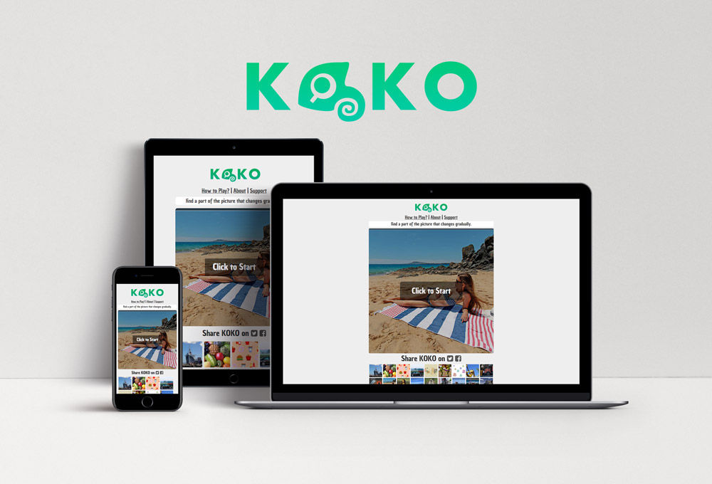
Koko is a web-based spot-a-difference game inspired by the game “Aha Experience,” which was popularized by a Japanese TV show more than a decade ago. By making this nostalgic game browser-based, I have made it easier than ever for anyone to play. All you need is your smartphone or computer!
My Role
In this project, I did all of the processes including coming up with the idea, researching, designing, user testing, and coding by myself.
Target users
The game is family-friendly and simple enough so it can be played by a wide range of demographics. I made this game as a web-based because users can play anytime they want without spending a long time to install it on any device with a web browser. Each game will be done in ten-second at the shortest.
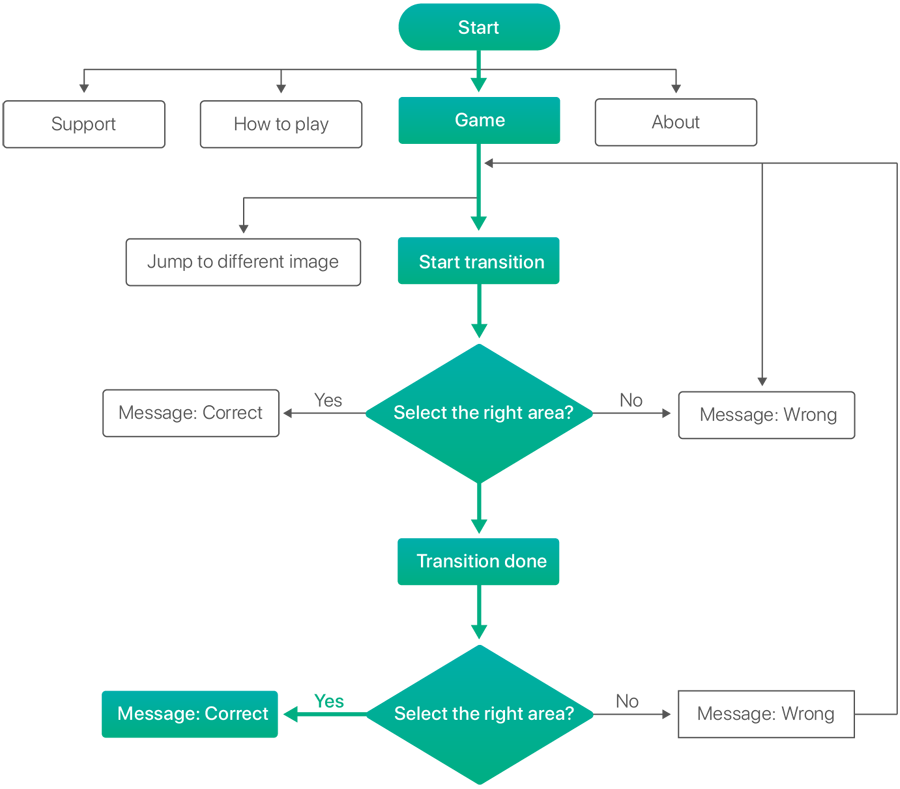
Flowchart

How does it work?

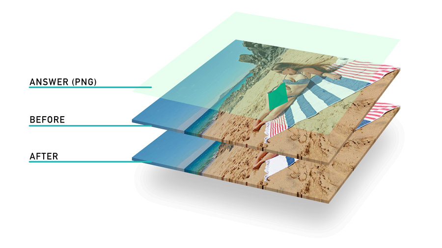
When the player taps(clicks) the start button, the top picture will start to lower its opacity slowly. Simultaneously, the picture at the bottom will start to appear. When user taps/clicks on the answer area (non-transparent part of the PNG file), it will define the tap as the correct answer.
To detect a click on the non-transparent pixels of the answer png, I used a script, AlphaPicker by escapism (GitHub).
Branding
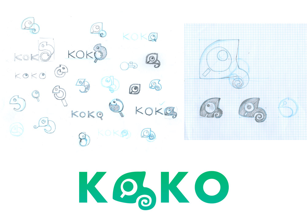
I made an overall brand image clean and playful, but not too childish because it is a game for everybody. I choose a soft light green to generate a playful feeling. Koko is a game with pictures changing gradually, so I used a chameleon as a main subject on the logo.

Business model
I came up with two ways to make revenue from the game. One way is on-page advertisements. Another way is sponsorship. Koko is a game that requires players to literally stare at pictures for a long time. I can create a custom picture that is made out of sponsors’ advertisements. To show the effectiveness of the ad on the game to the sponsors, I can track how long users spent time by using an access analysis tools such as Google Analytics. I made sure that both ways will not compromise the game experience.
User interface

In this project, I made sure that players do not get confused and frustrated while playing, and I also made sure that the game system will not accidentally reveal the answer. Subtle animation feedback and visual cues guide users to understand how to play the game intuitively. For example, the game image is dimmed until the player clicks the start button. It makes sure that they do not start looking around for the answer without actually starting the game. Small animation such as shaking the picture when the player gets a wrong answer helps them to understand what is going on intuitively.
User feedbacks
I conducted a user test at a local library. People who are around 10 to 20 years old played the game for 5 minutes to test the product.
User Interface / User Experience: ? Most of players including, children who are less than 10 years old easily understood how to play the game in less than a minute.
Game Level: ? Although some players found some of levels are too difficult, most of players got into the game and played more than two minutes continuously.
Conclusion
Although it was a relatively small project, by doing all of the processes by myself, I’ve gained a much better understanding of how each process interconnect with each other. I learned what has to be shared between each process to achieve smooth project managing.